Logo Redesign
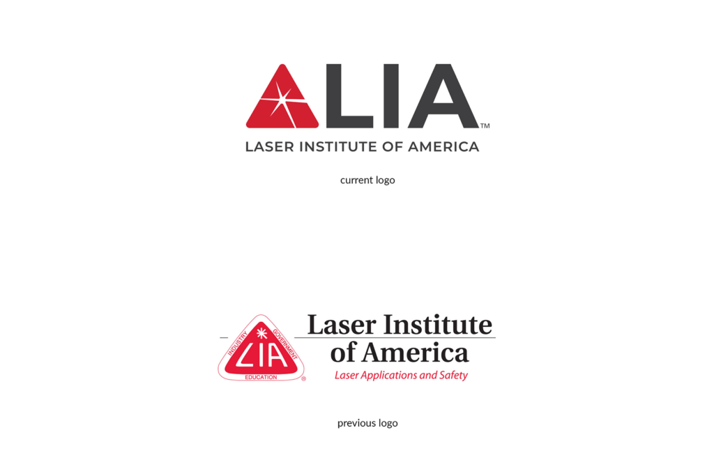
As the Laser Institute of America approaches 50 years, it was time to modernize the logo. The previous logo contained many elements, taglines, and 3 pillars that would constantly be omitted on small prints. The new approach takes the laser beam with a more dynamic approach while still retaining the roundness of the previous logo.


Stationery Design
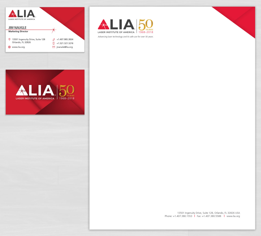
A new logo means new stationery. The new logo allows the laser beam to be used in other elements, such as the business card. The main triangular shape allows patterns and overlays to be created as accent designs.
Tradeshow Booth Design
The LIA exhibits at multiple conferences throughout the year, a new booth design was needed following the rebrand, challenges included ensuring our main tagline could be displayed, even when tables were obstructing the bottom half of the booth. A modular approach was used so the booth can expand for wider settings or shrink to smaller spaces.
