American Cancer Society
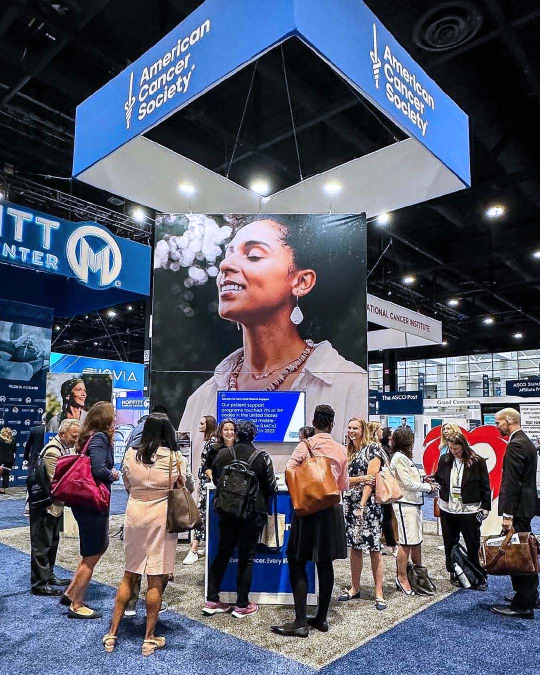
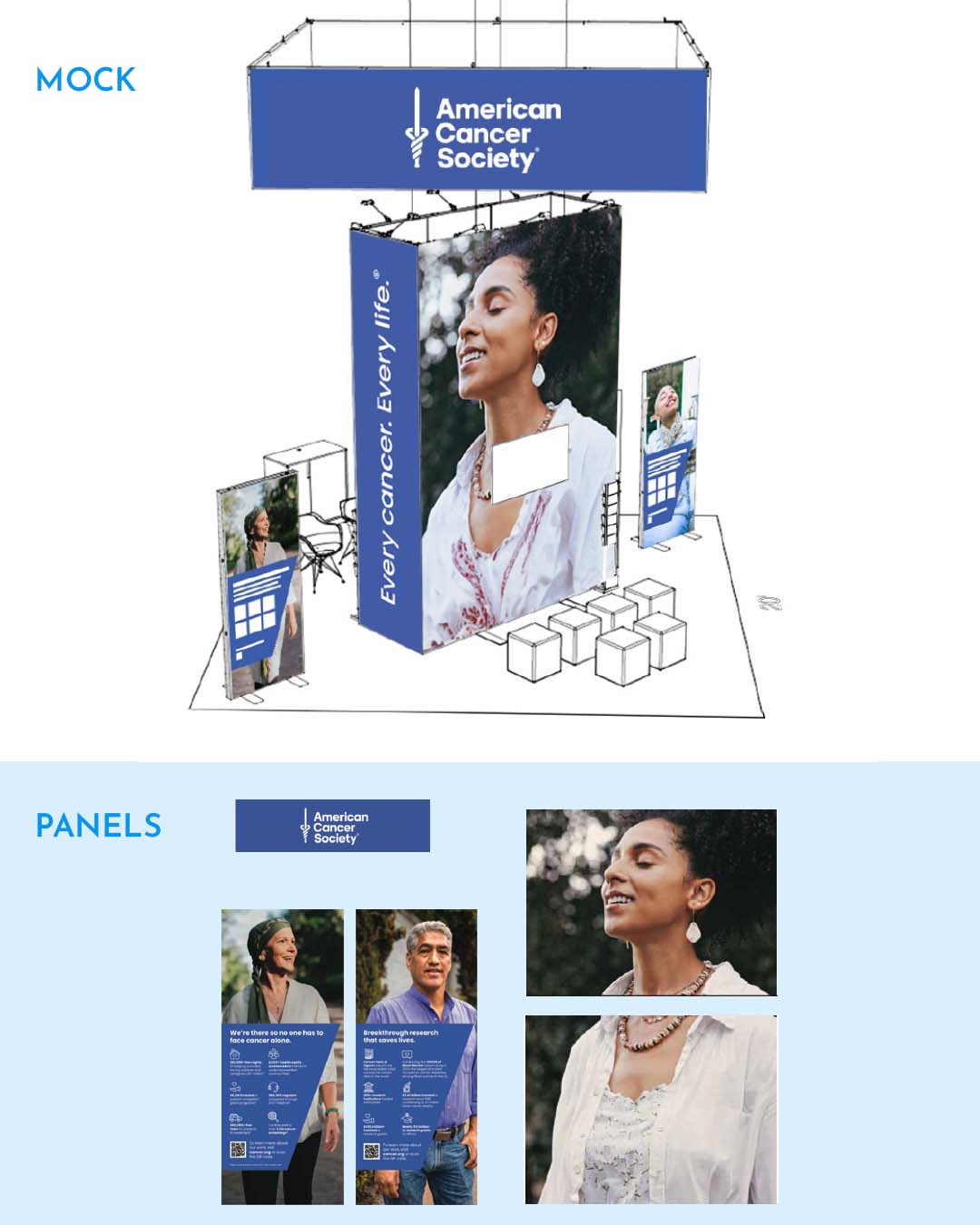
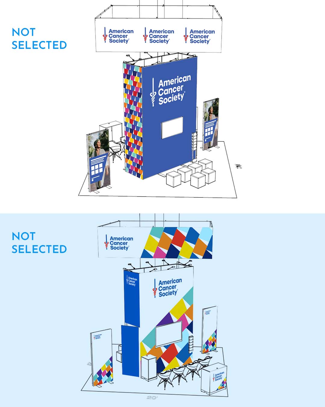
The American Cancer Society wanted to make a strong appearance at an oncology conference. Some challenges faced were ensuring the entire display doesn’t blend in with surrounding booths, especially because blue was a popular color at the exhibit. One way to tackle this problem is to add a more human touch to the design featuring various portraits mixed with brand elements, rather than focusing on having scientific graphics.
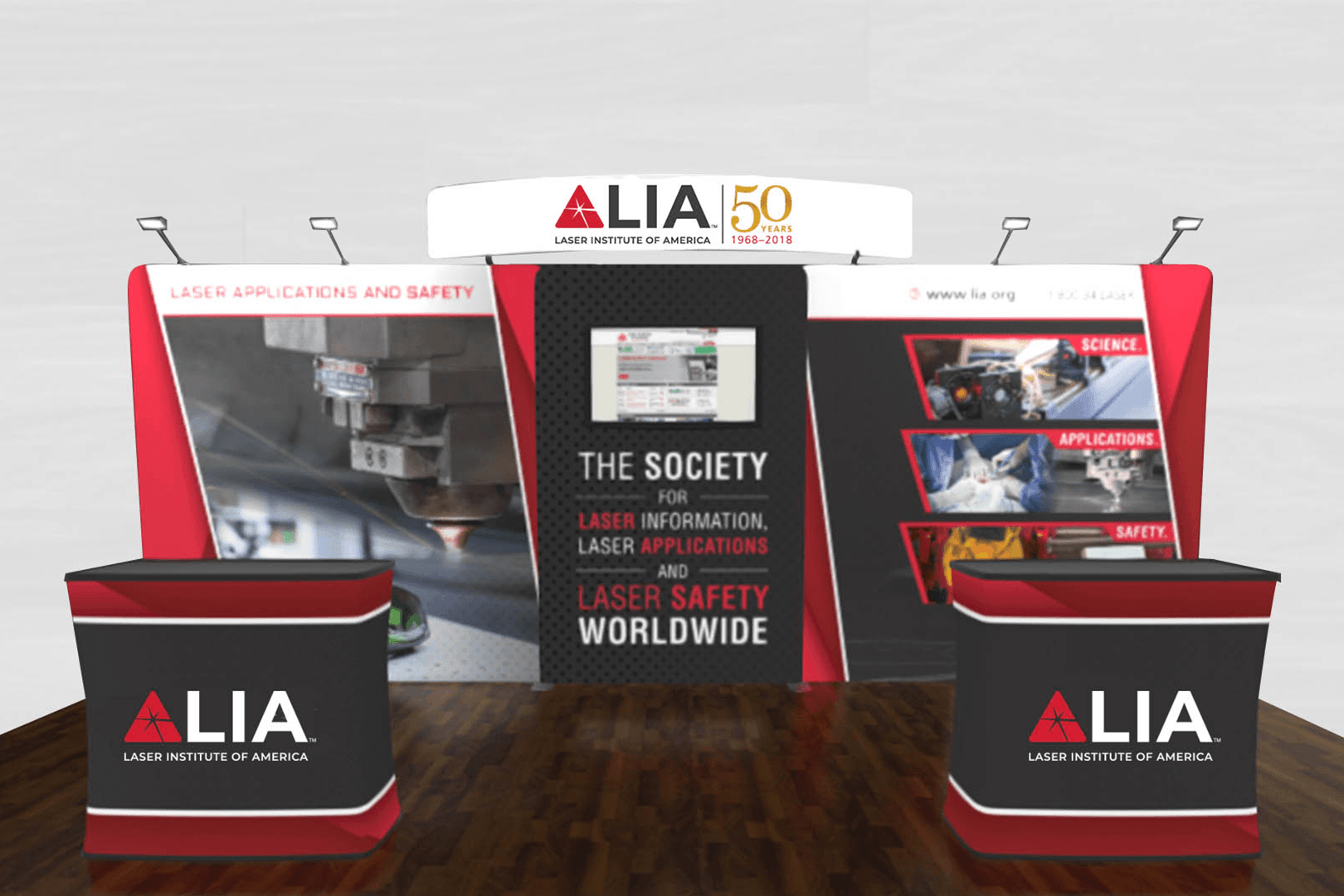
The Laser Institute of America
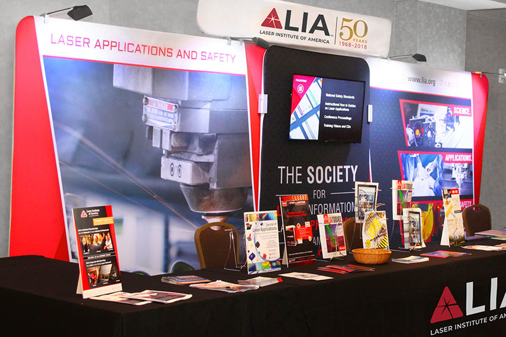
The Laser Institute of America (LIA) underwent a full rebrand and needed a new booth for conferences and exhibitions. The challenges faced were ensuring this booth can adapt to smaller exhibit spaces where all 3 panels couldn’t be used. My solution to this was making the middle panel pair with either of the larger panels ensuring the LIA’s mission is always on display (The society for laser innovation) even when a table is placed in front.